


6
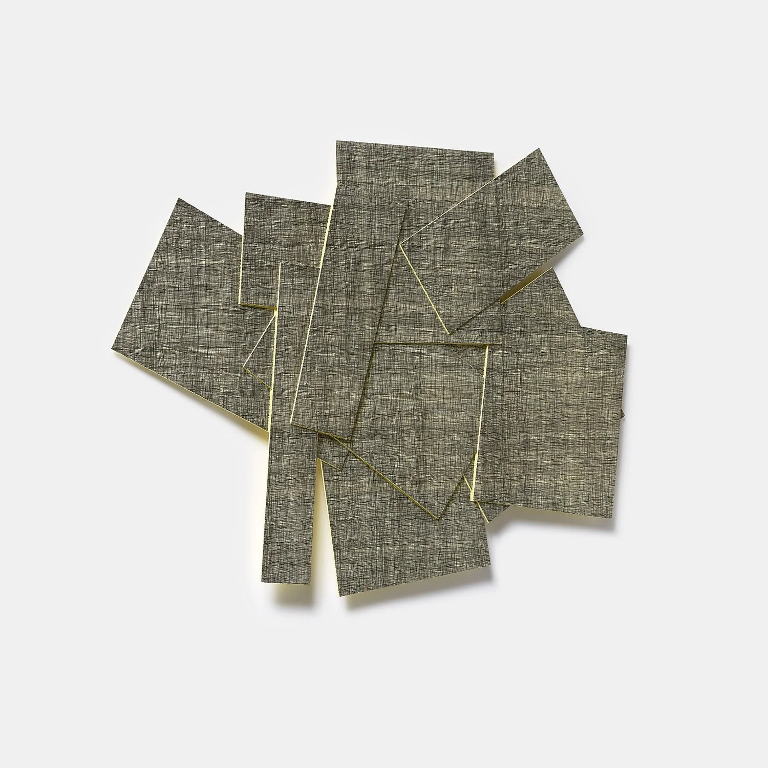
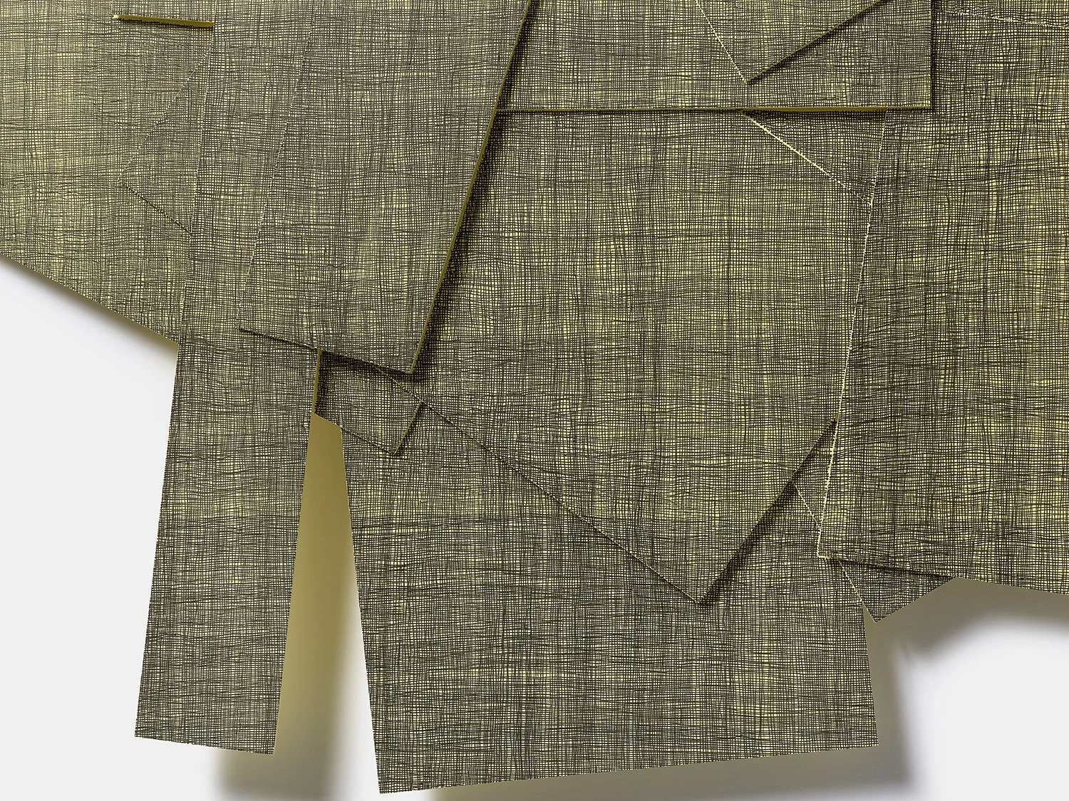
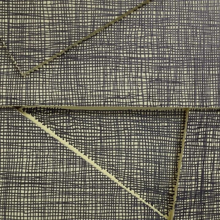
Quietude | 2026
2
Extract from Anecdotes of Painting | 2026 (TP)
4
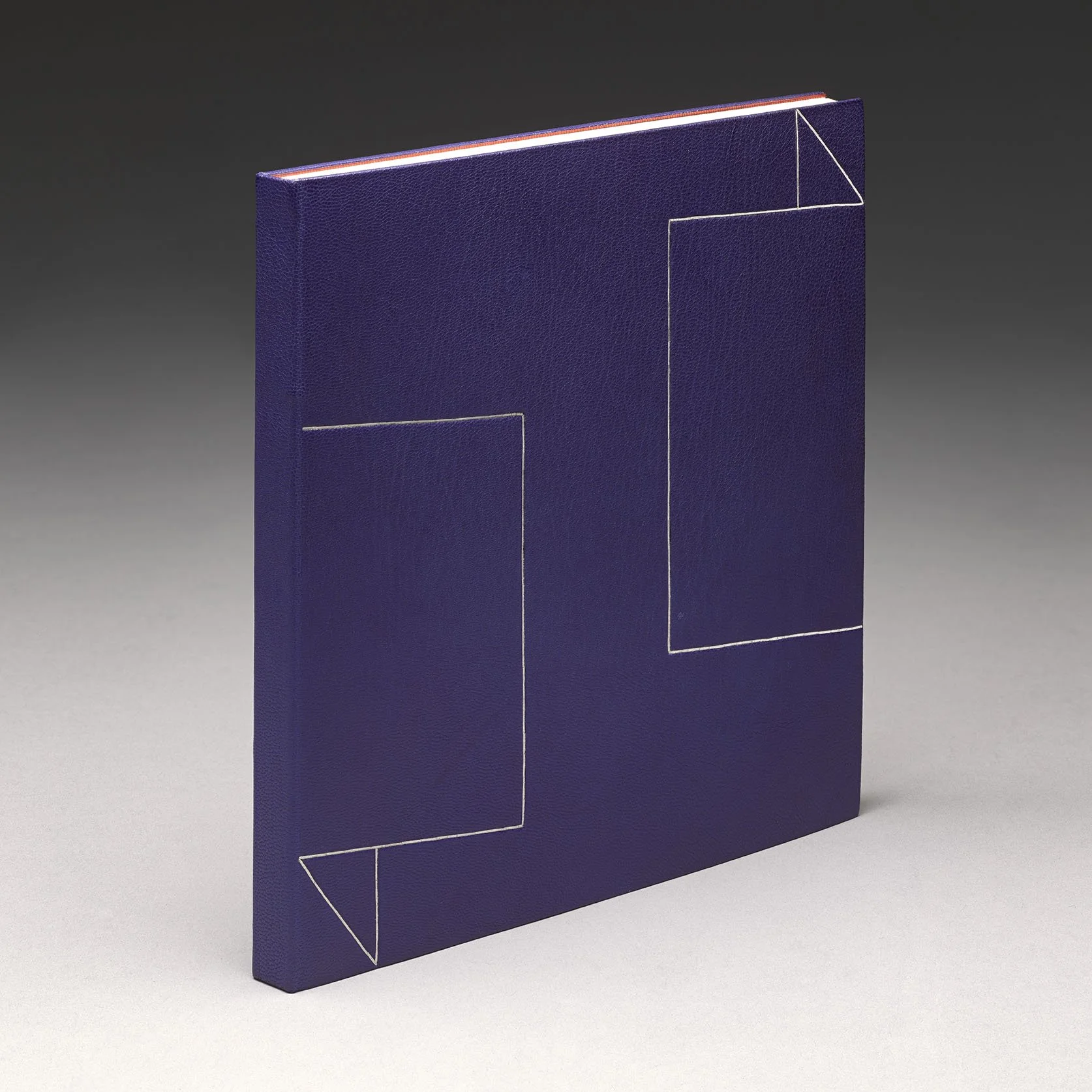
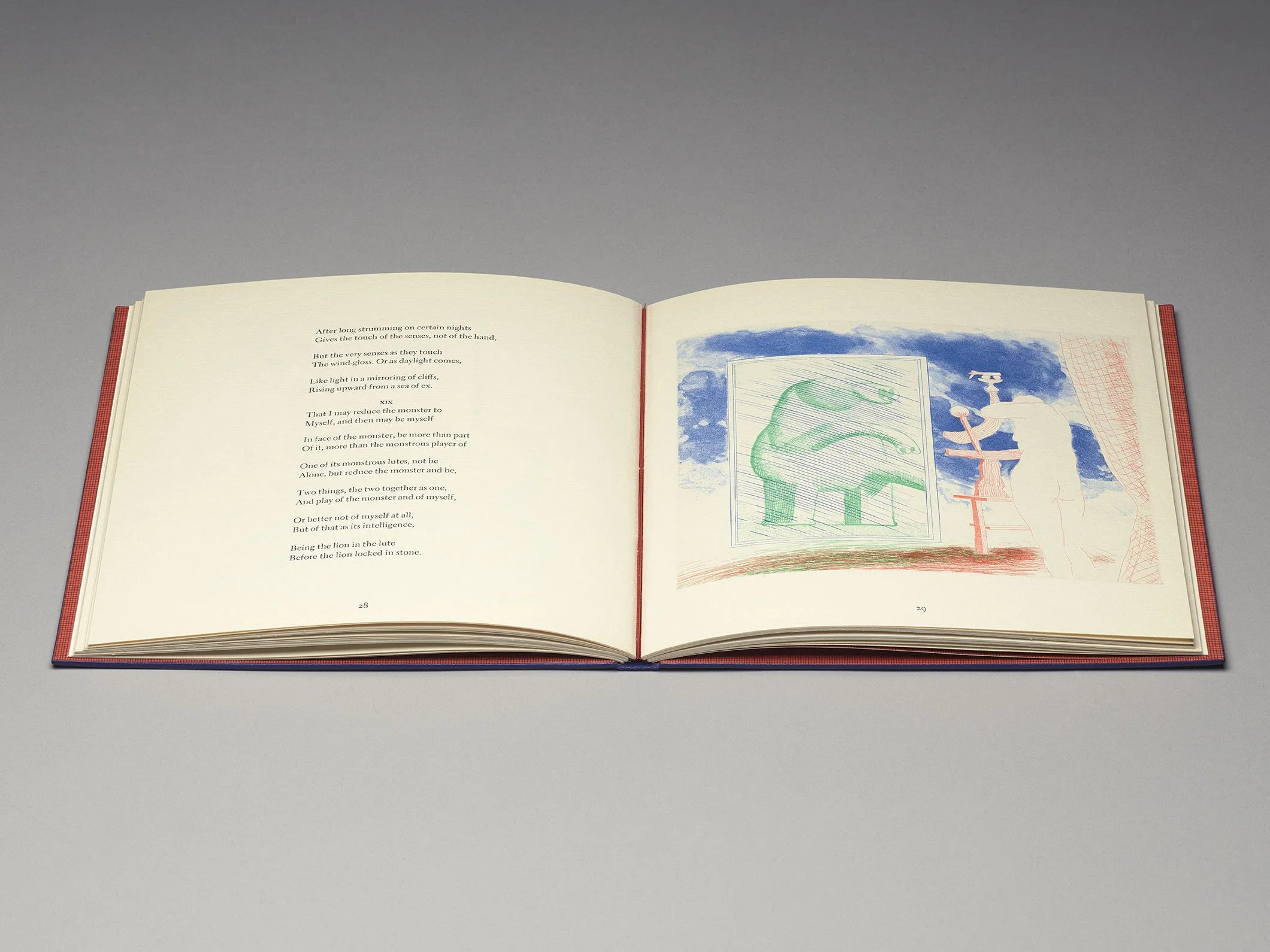
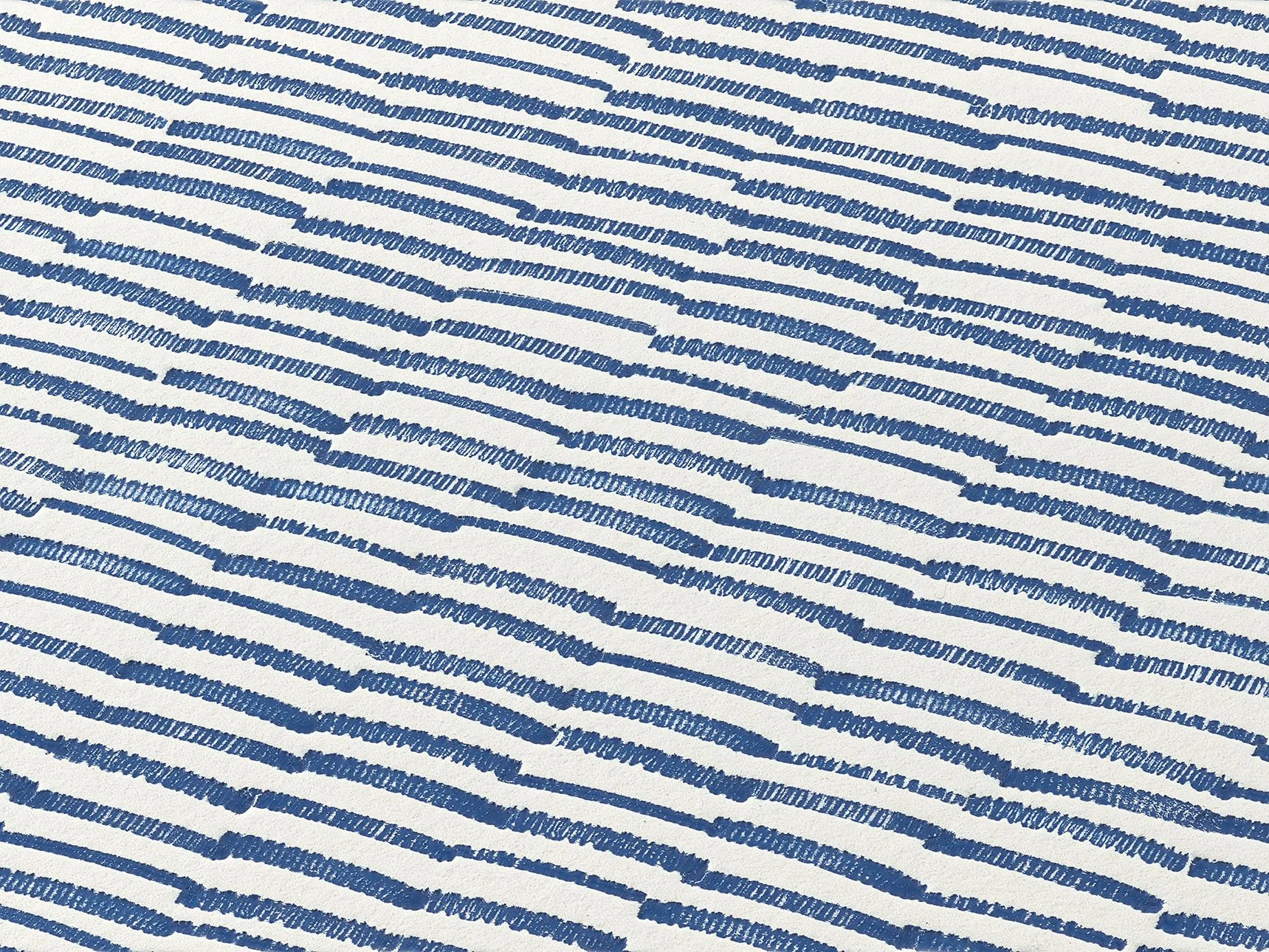
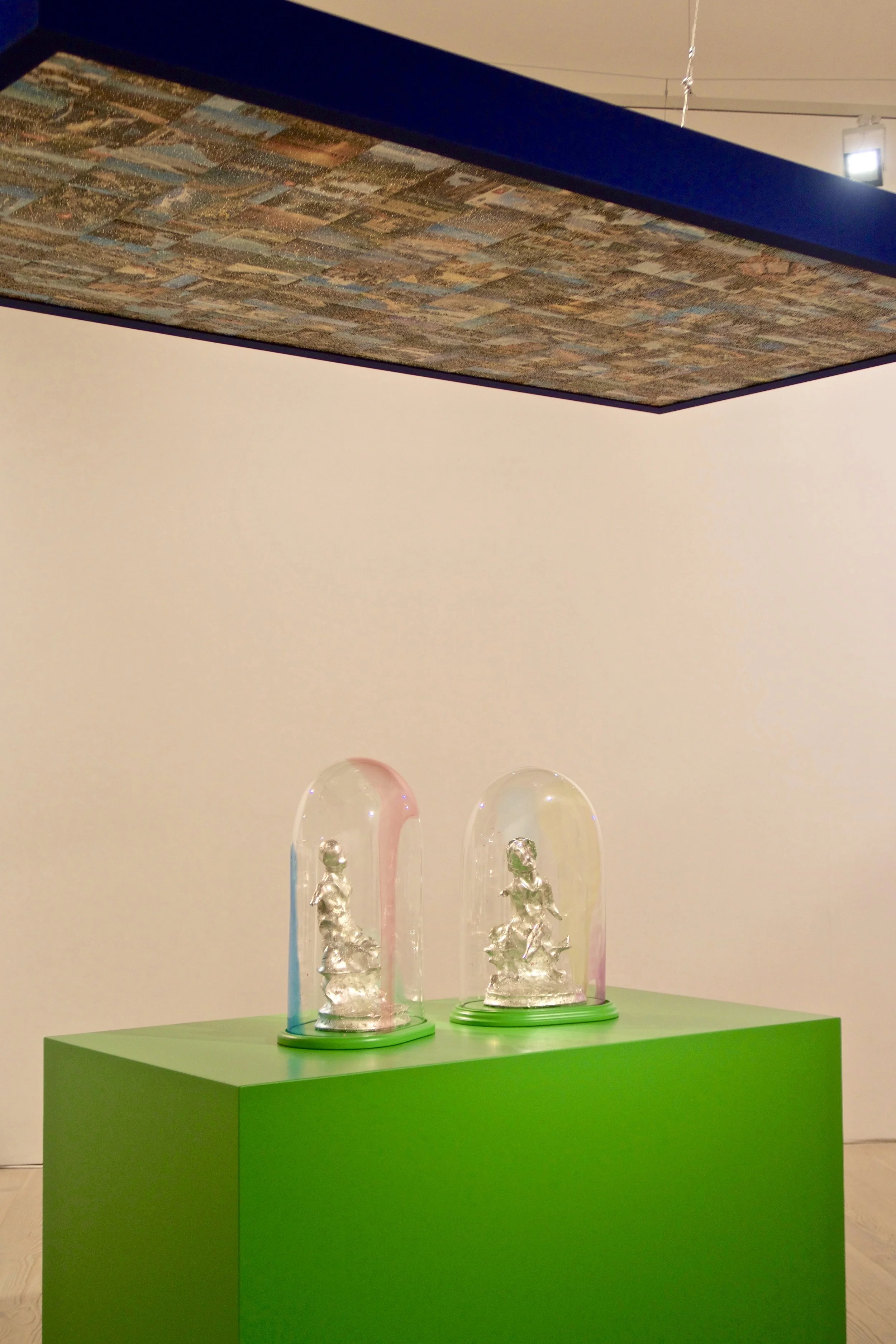
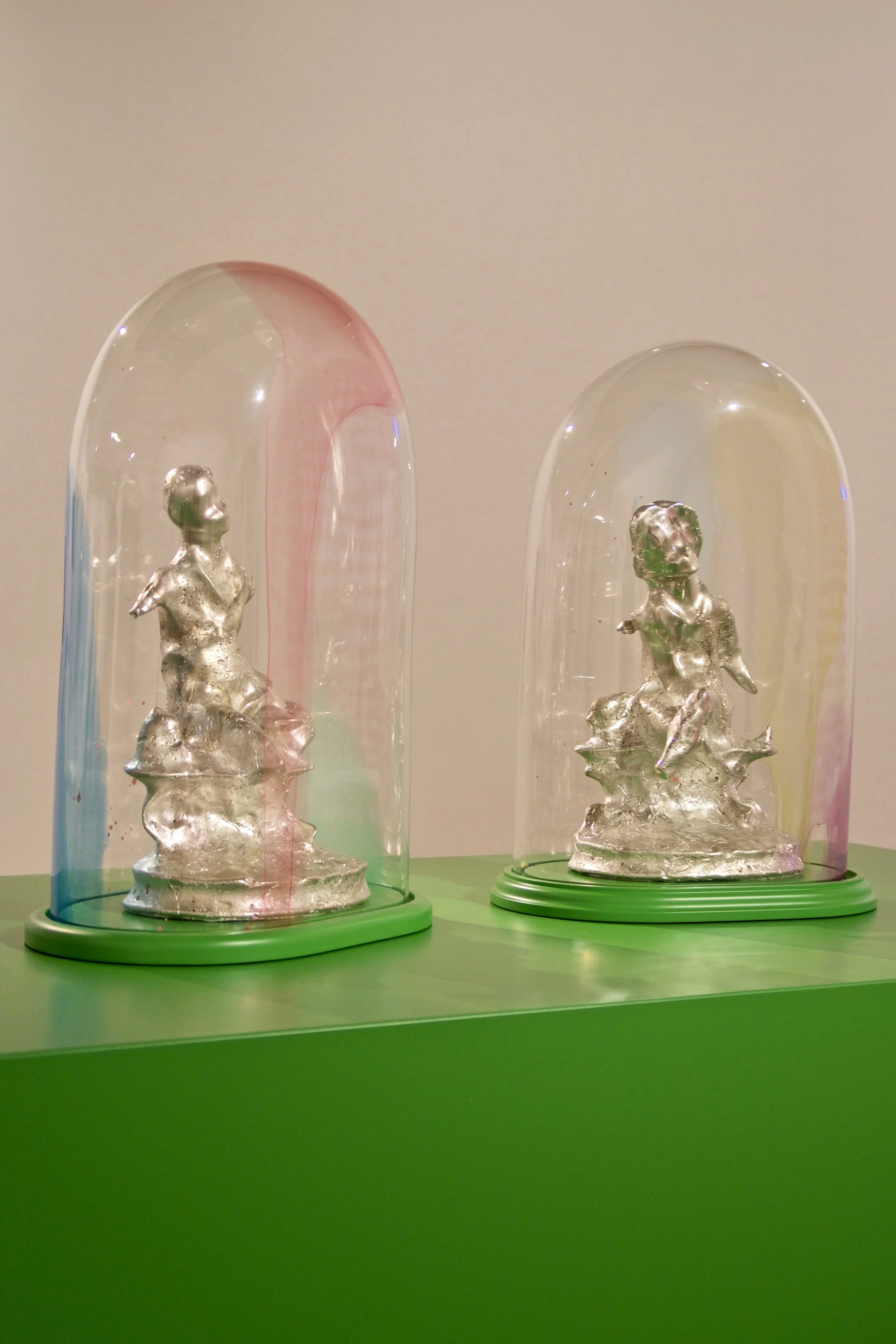
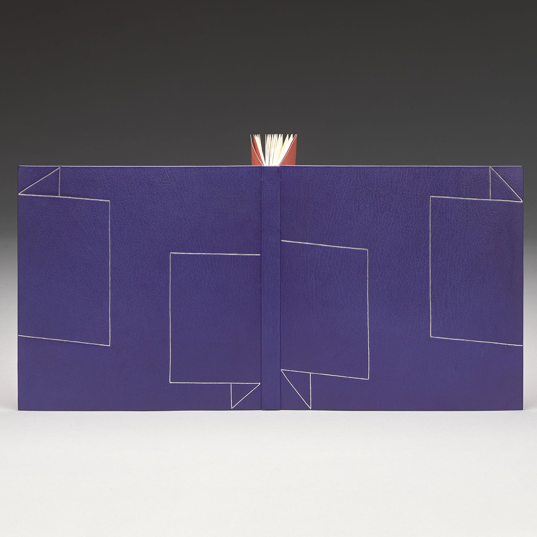
The Blue Guitar | 2026
6
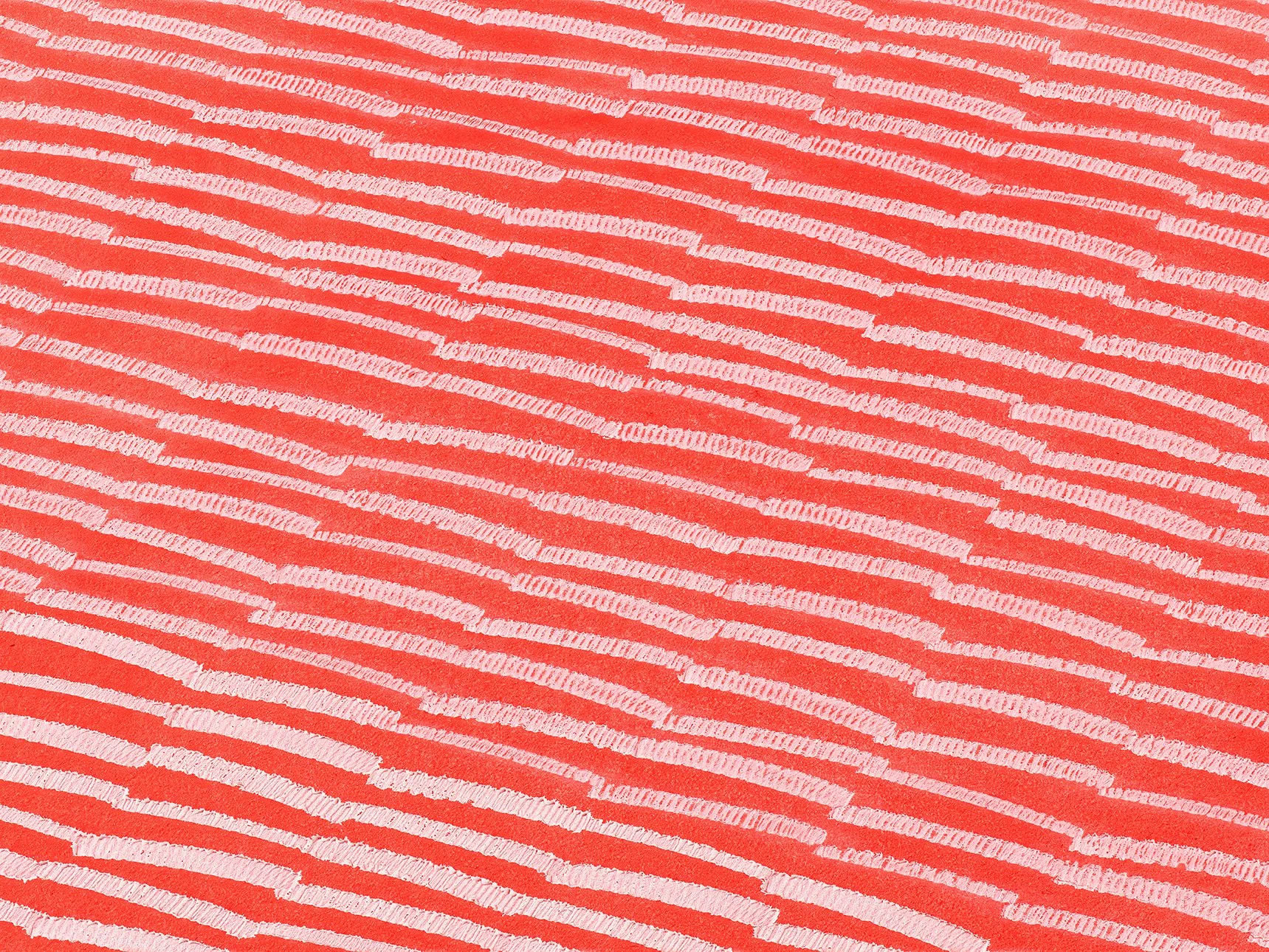
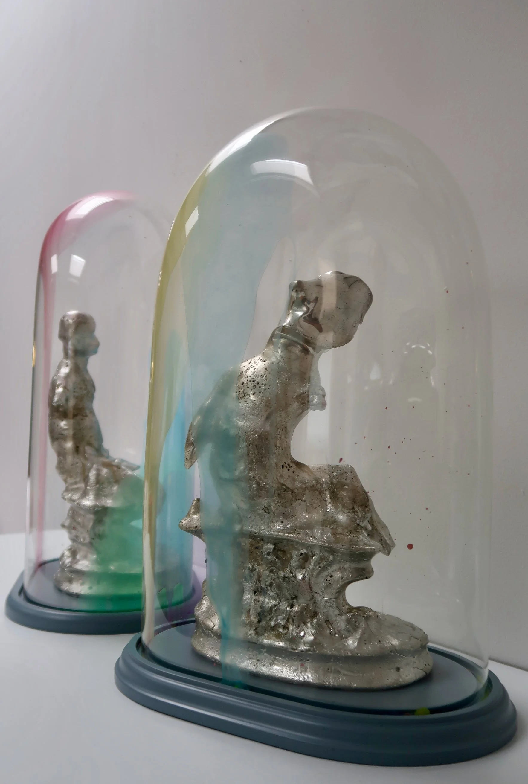
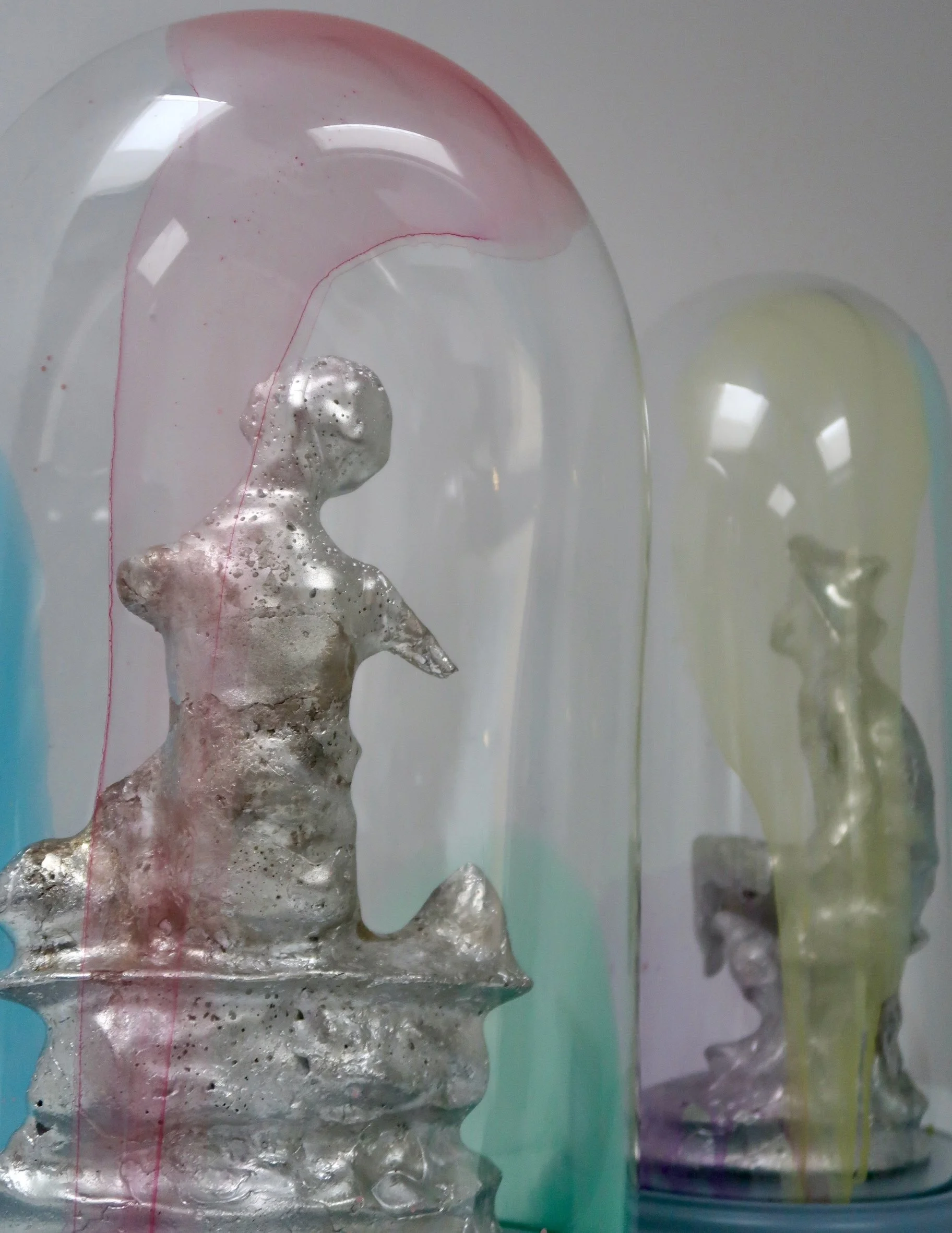
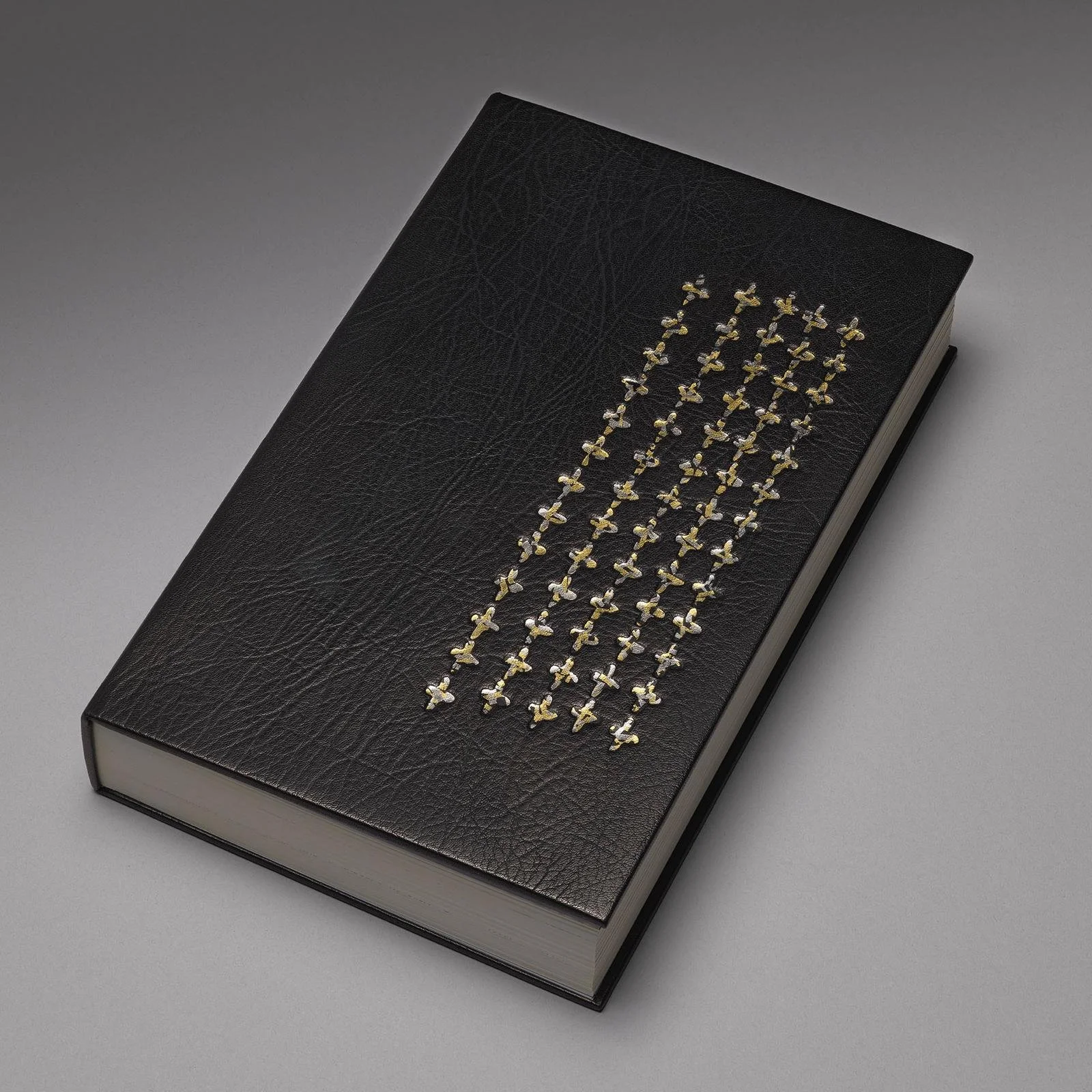
In Principio | 2025
6
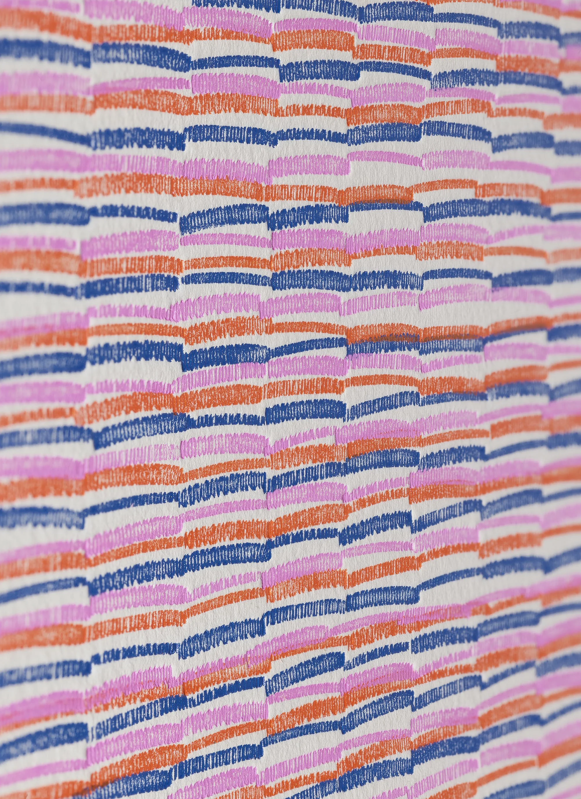
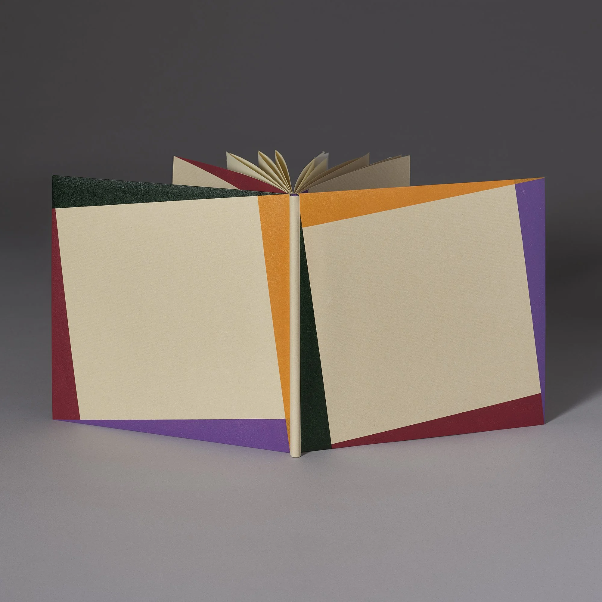
Two Dutchies | 2024

2
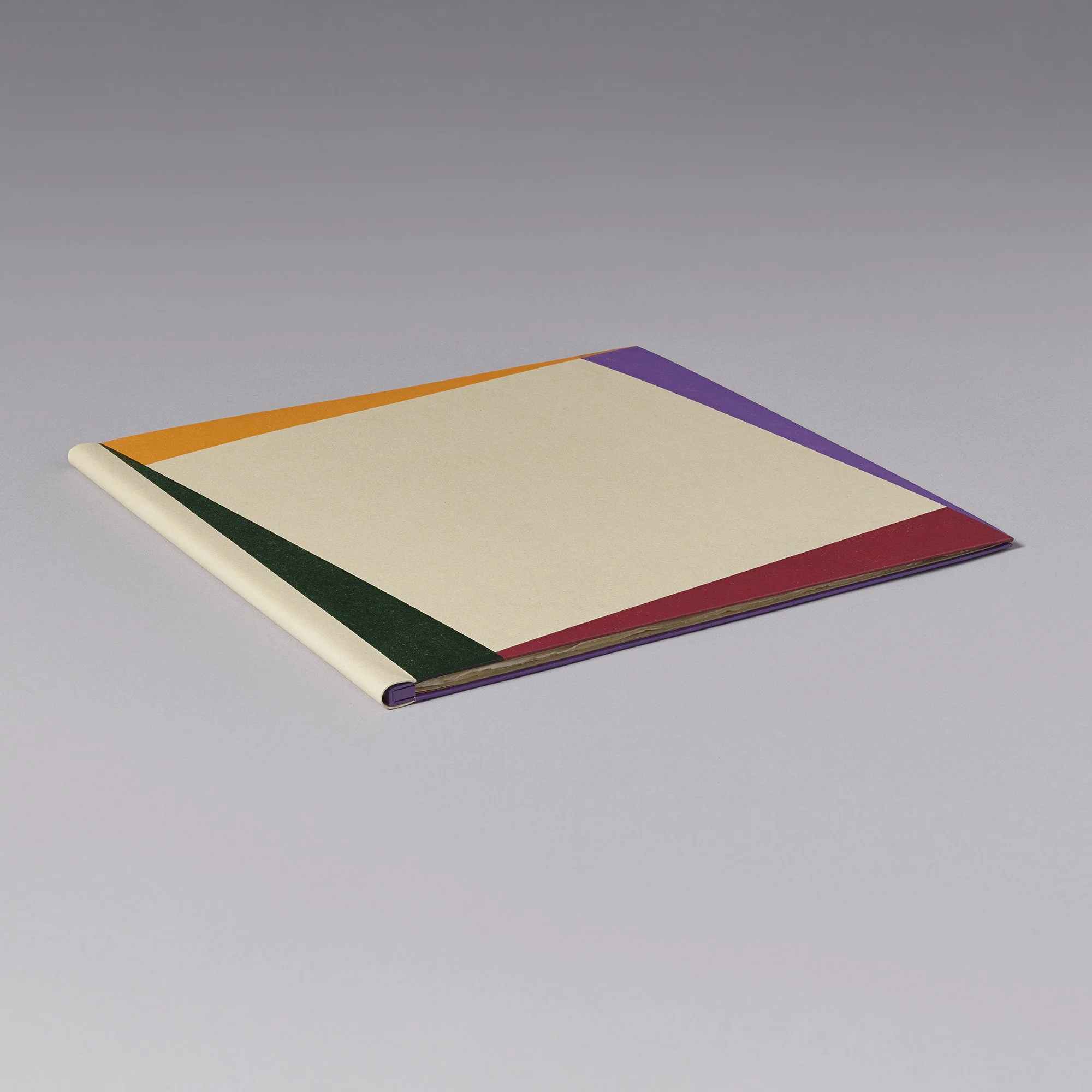
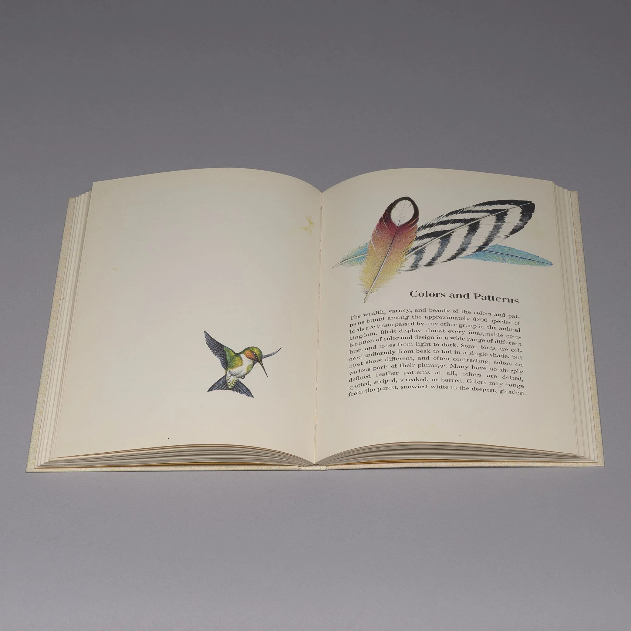
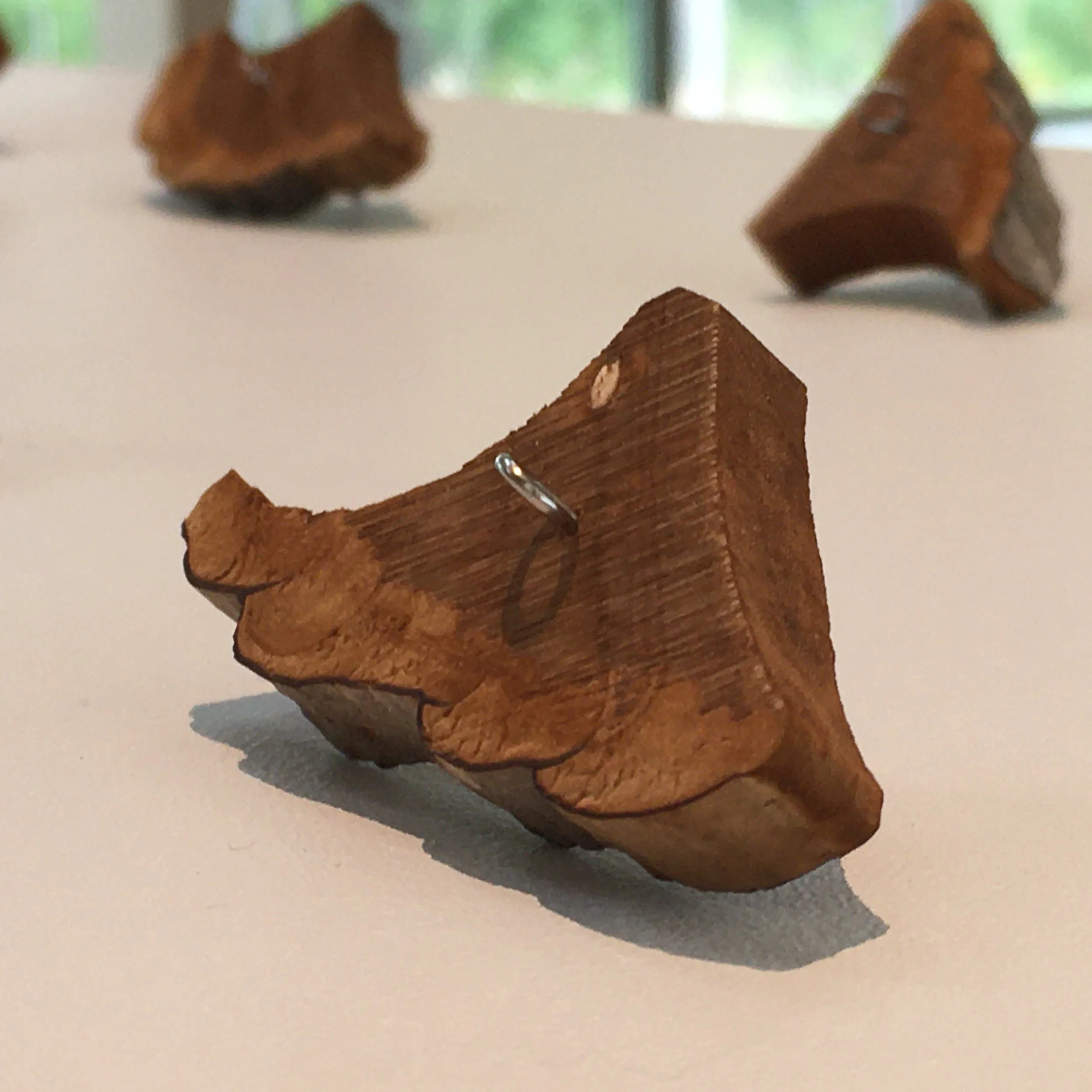
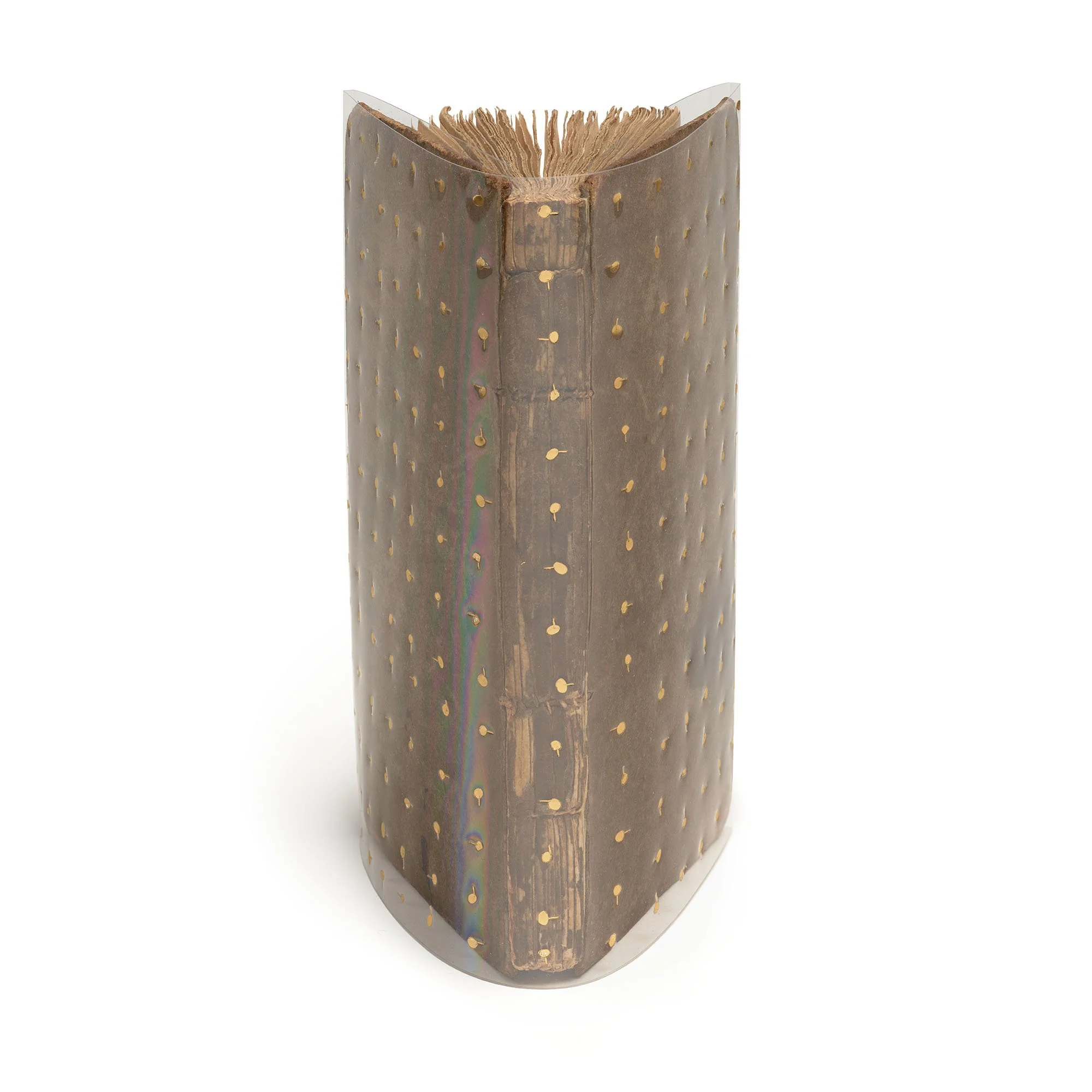
Feathers, Plain and Fancy | 2024

6
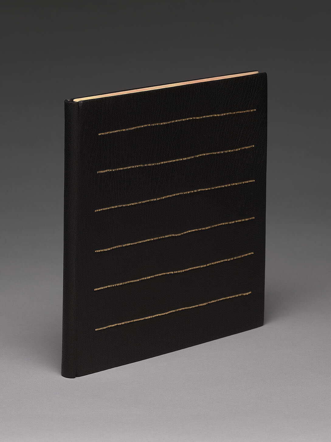
Black Marigolds | 2024
4
The Seasons | 2024 (TP)

3
Shift Quartet | 2023
2
Overlap Series, no. 1 | 2023
2
Overlap Series, no. 2 | 2023

4
Overlap Series no. 3 | 2023

3
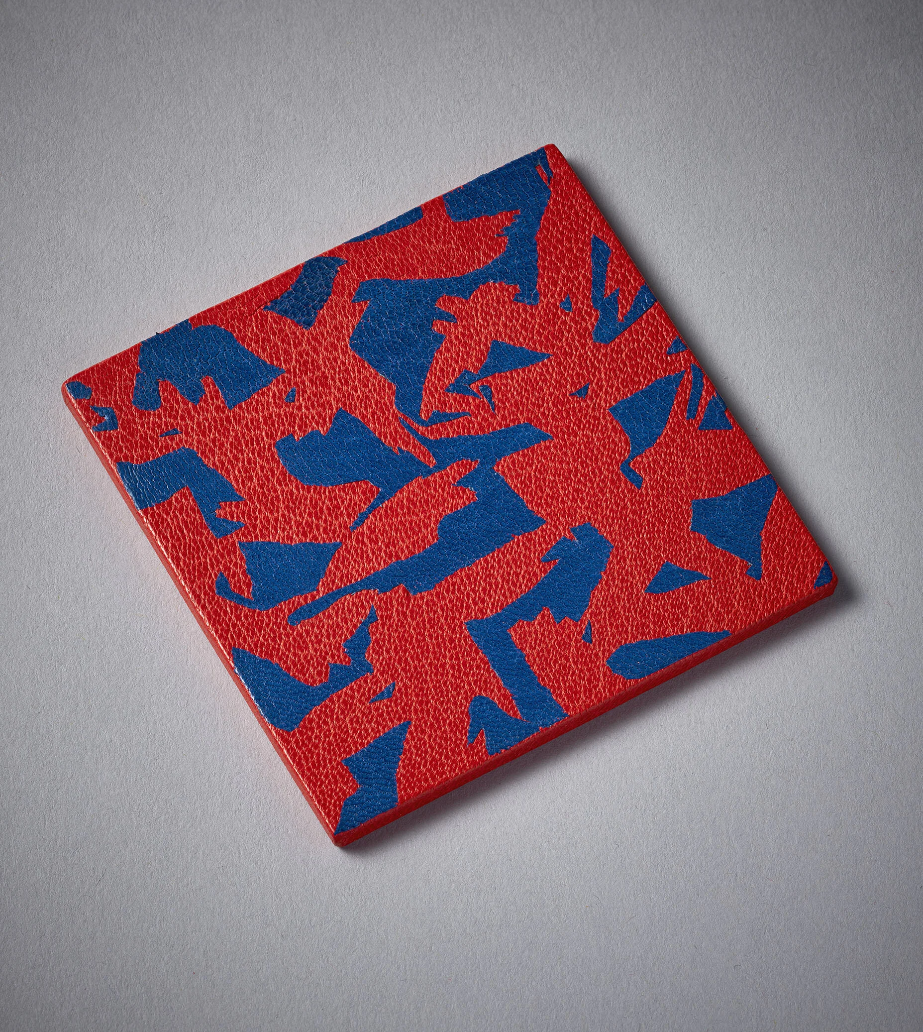
A Case of Conscience | 2022
4
Field Notes | 2022

3
Land | 2022
3
Side-on | 2021
2
PANCKOUCKE: ENCYCLOPEDIE METHODIQUE - THE TALOR | 2022 (TP)

4
THE LORD TOOK 10,000 OF MY SHEEP | 2022

4
A LITTLE TREACHERY (III) | 2022

3
Sylvae | 2021
4
Cherry Tree | 2021

3
The Space Inbetween | 2021

3
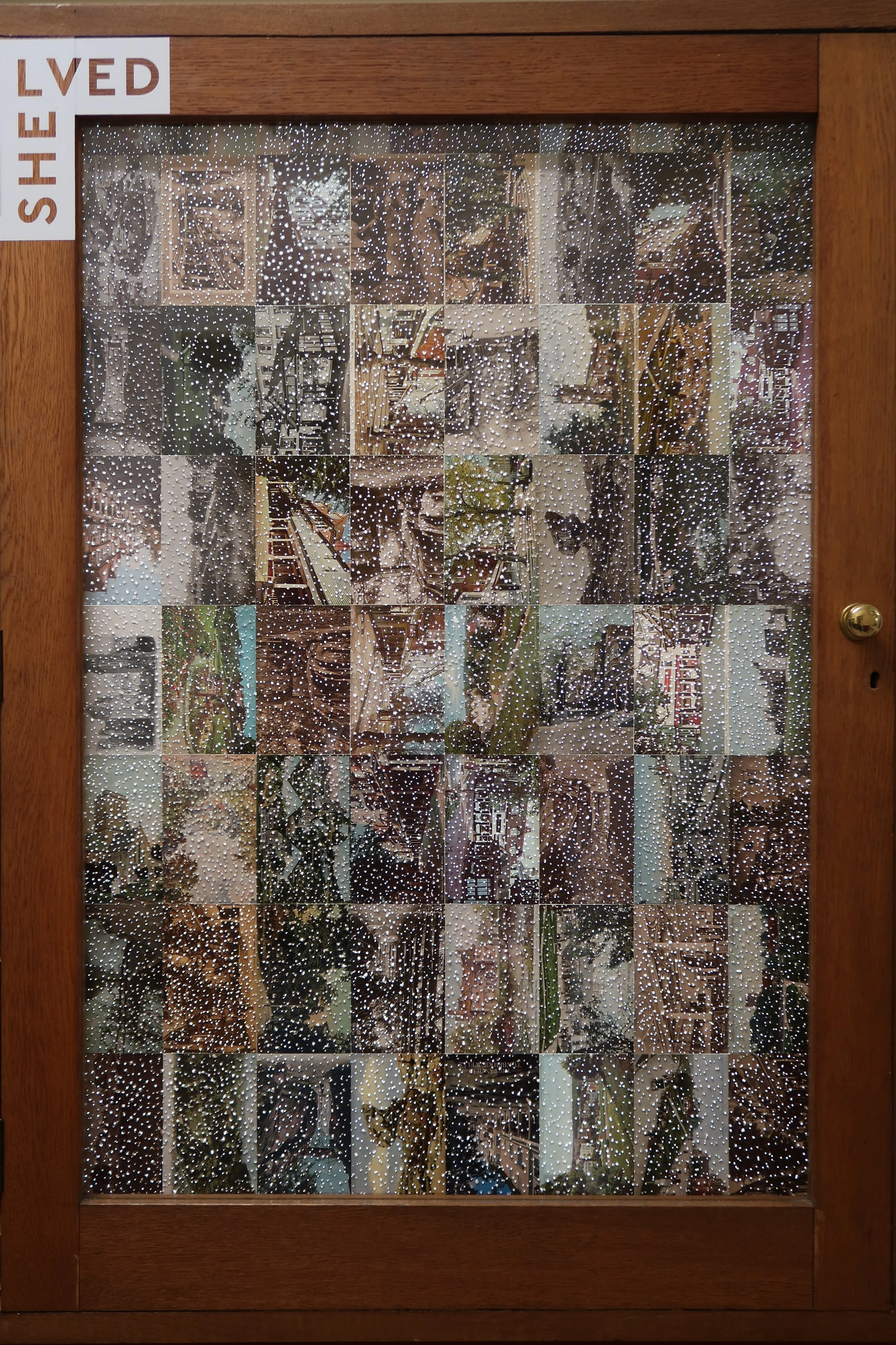
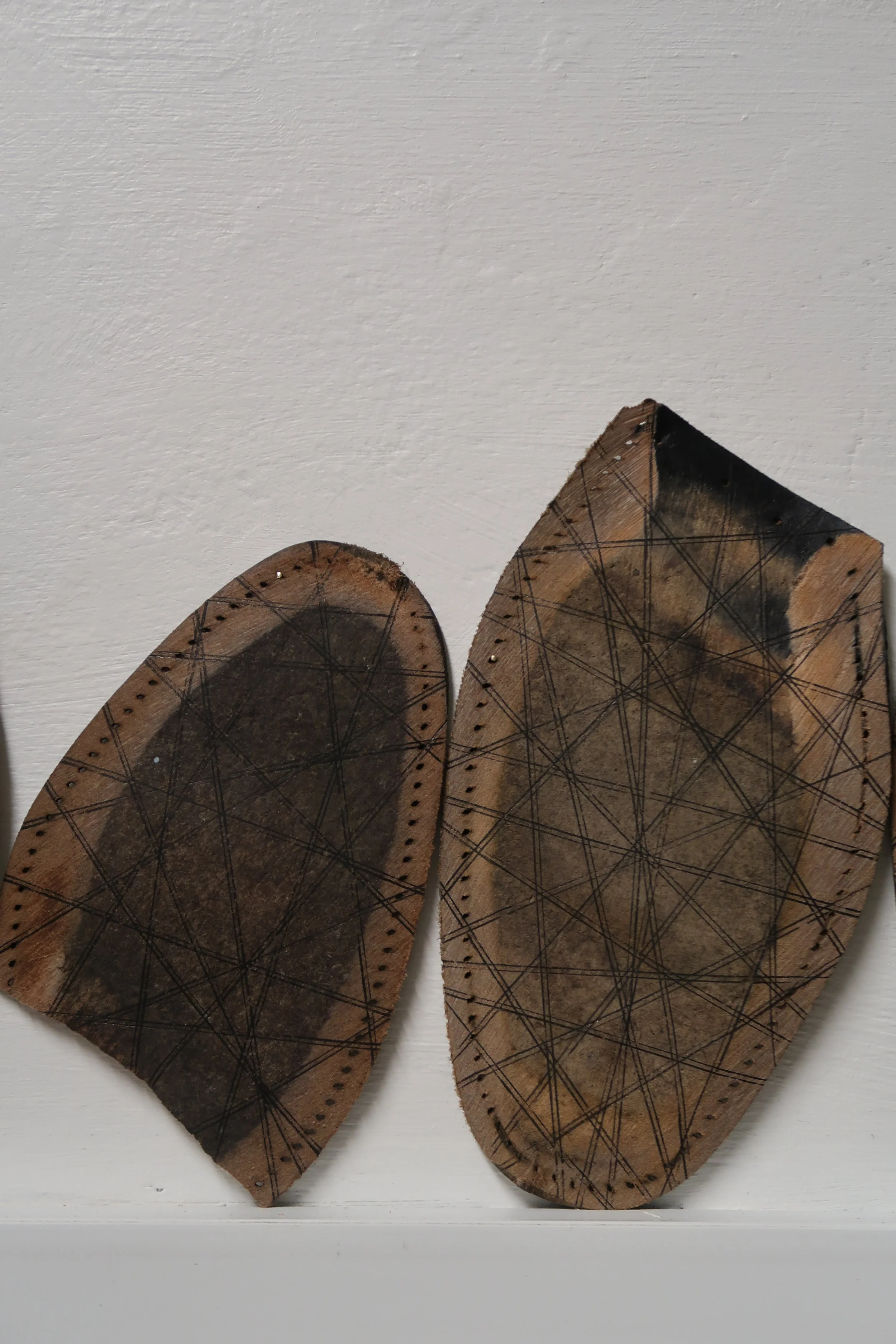
Shelved | 2020

7
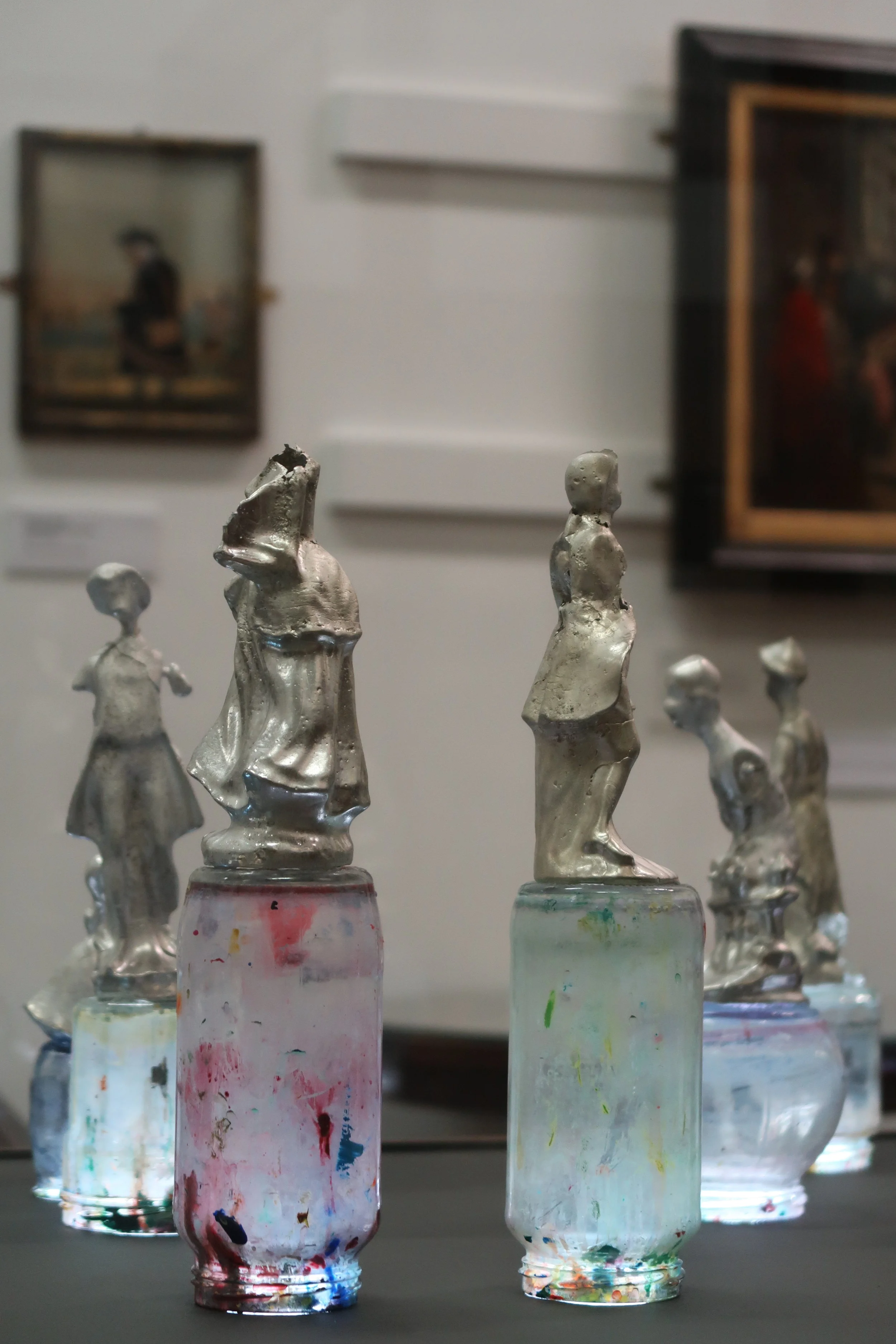
Each day is different | 2020

3
Portrait | 2020
4
Figured | 2020

3
Renascence | 2019
2
B-Side | 2019
5
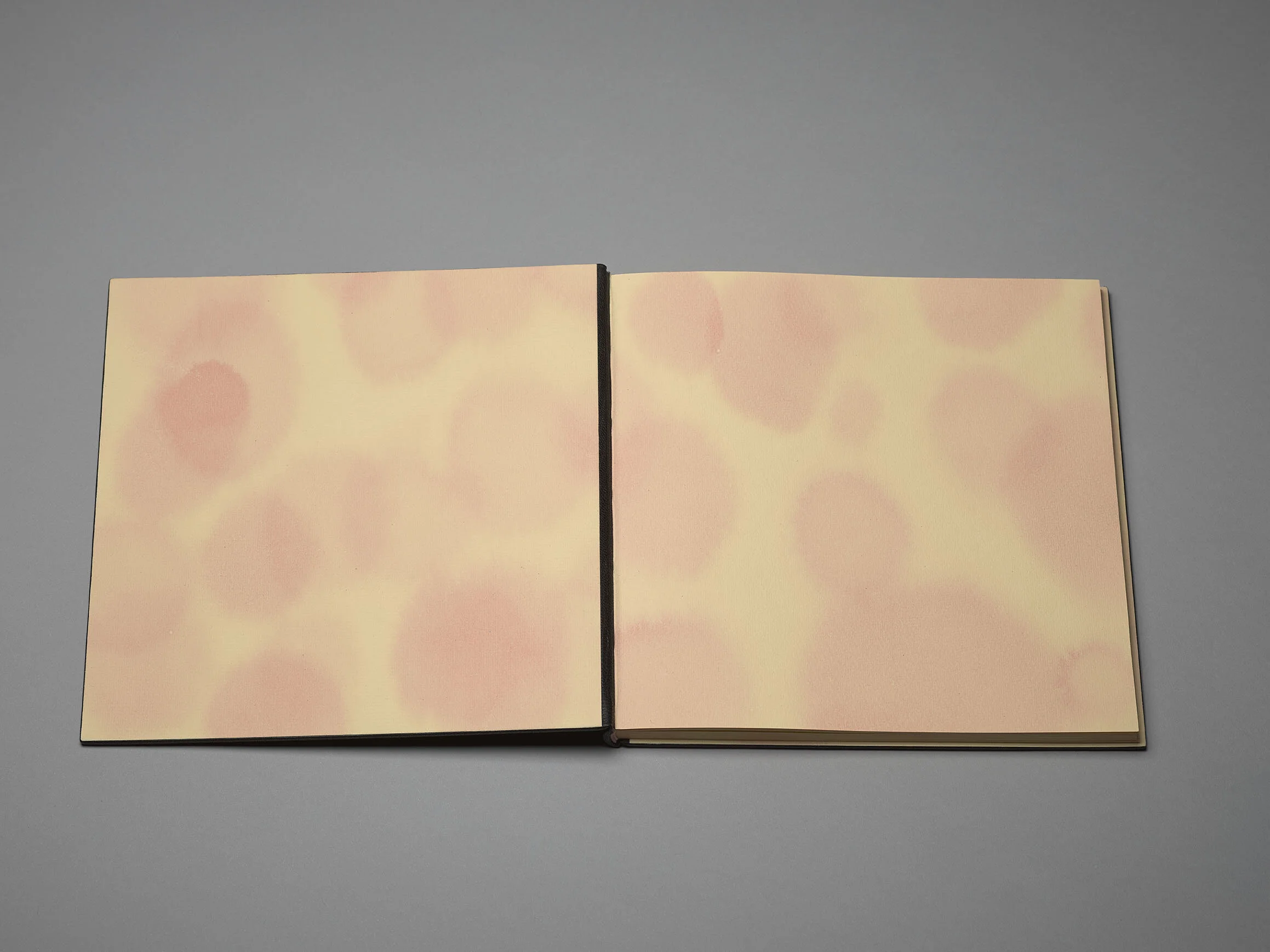
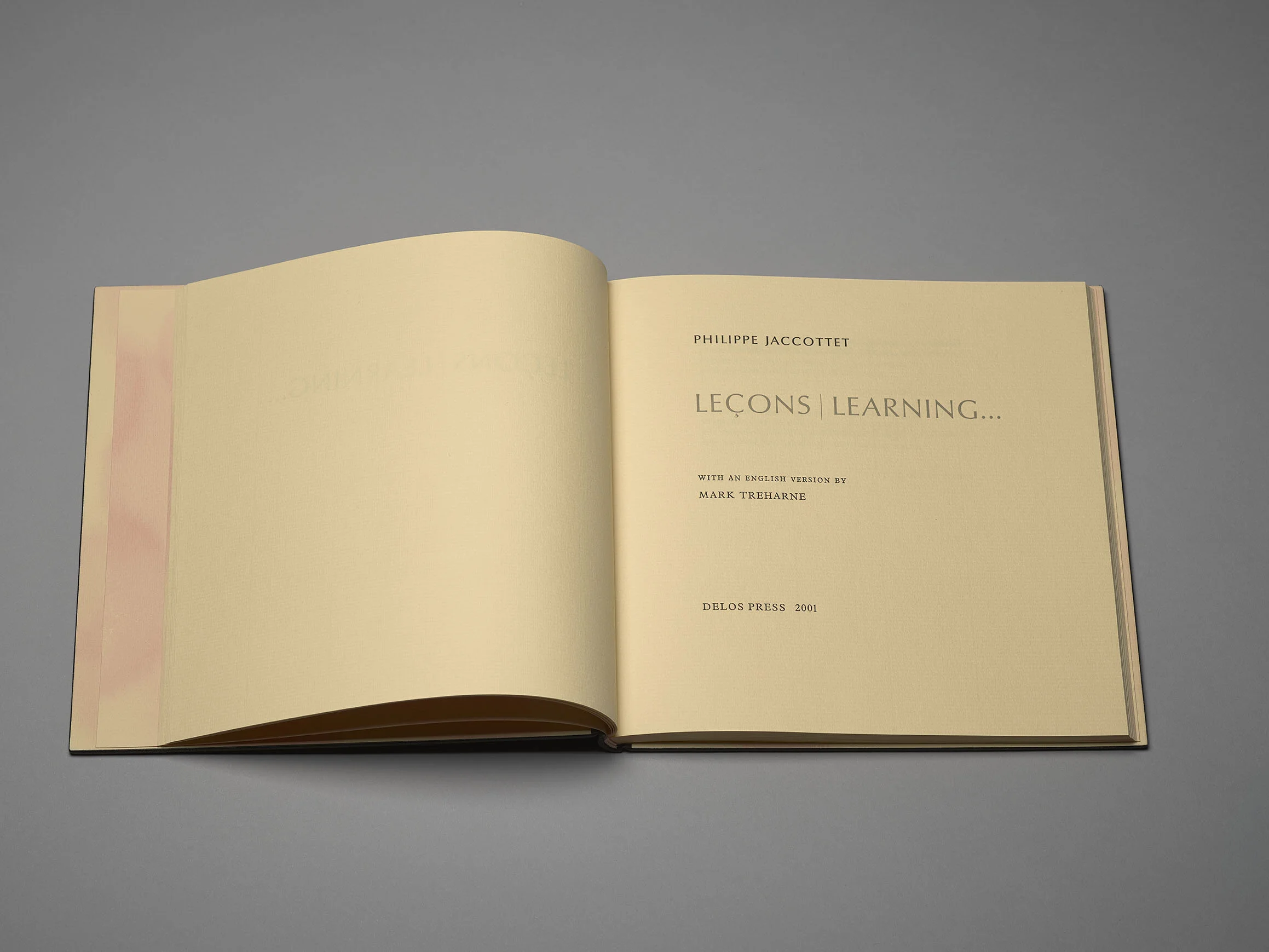
Leçons | Learning... | 2019

0
La Prose du Transsibérien | 2019

3
ROOM | 2019

1
Hoppus's Practical Measurer | 2019 (TP)

3
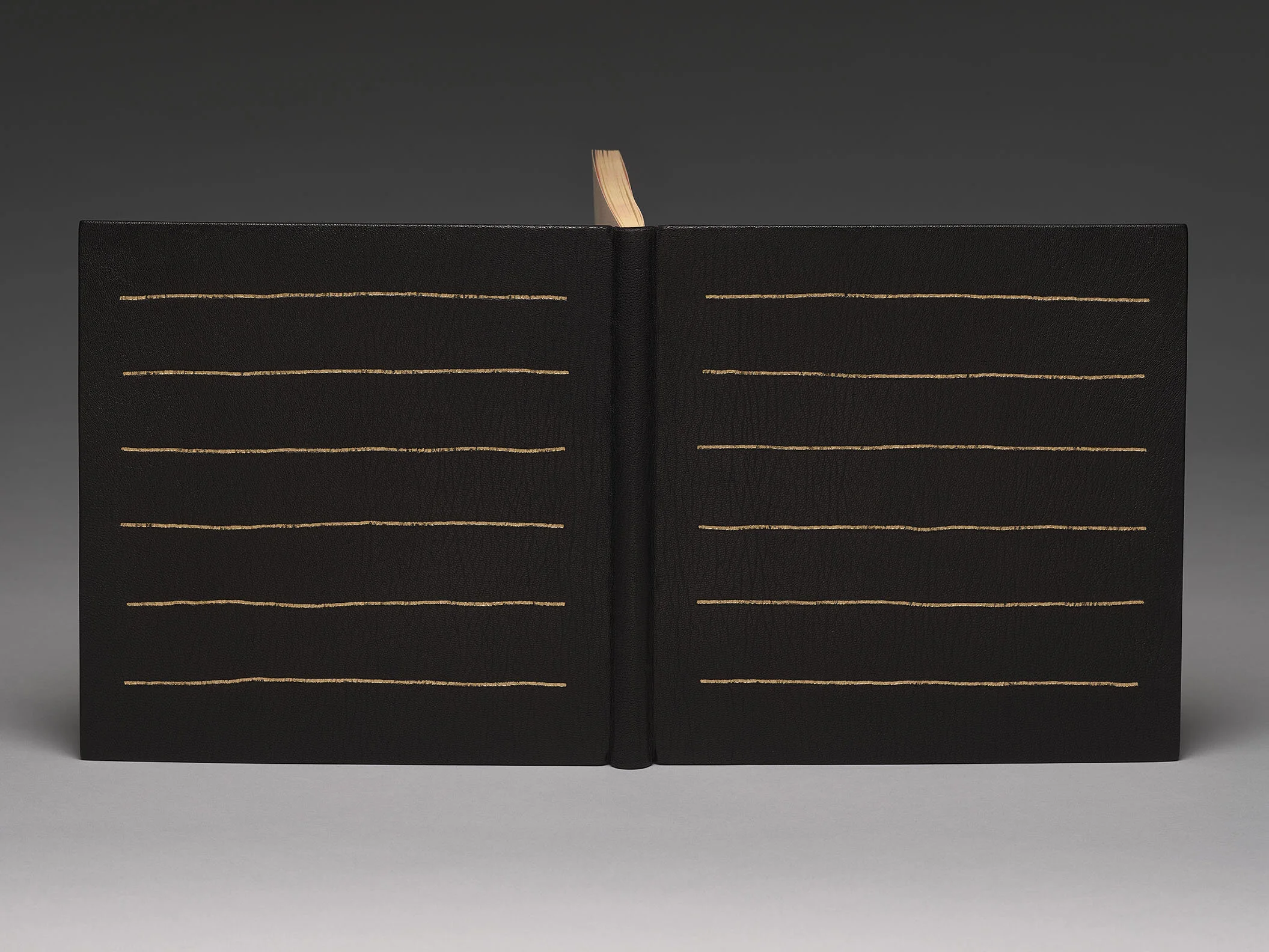
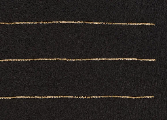
Leçons | Learning... | 2018
2
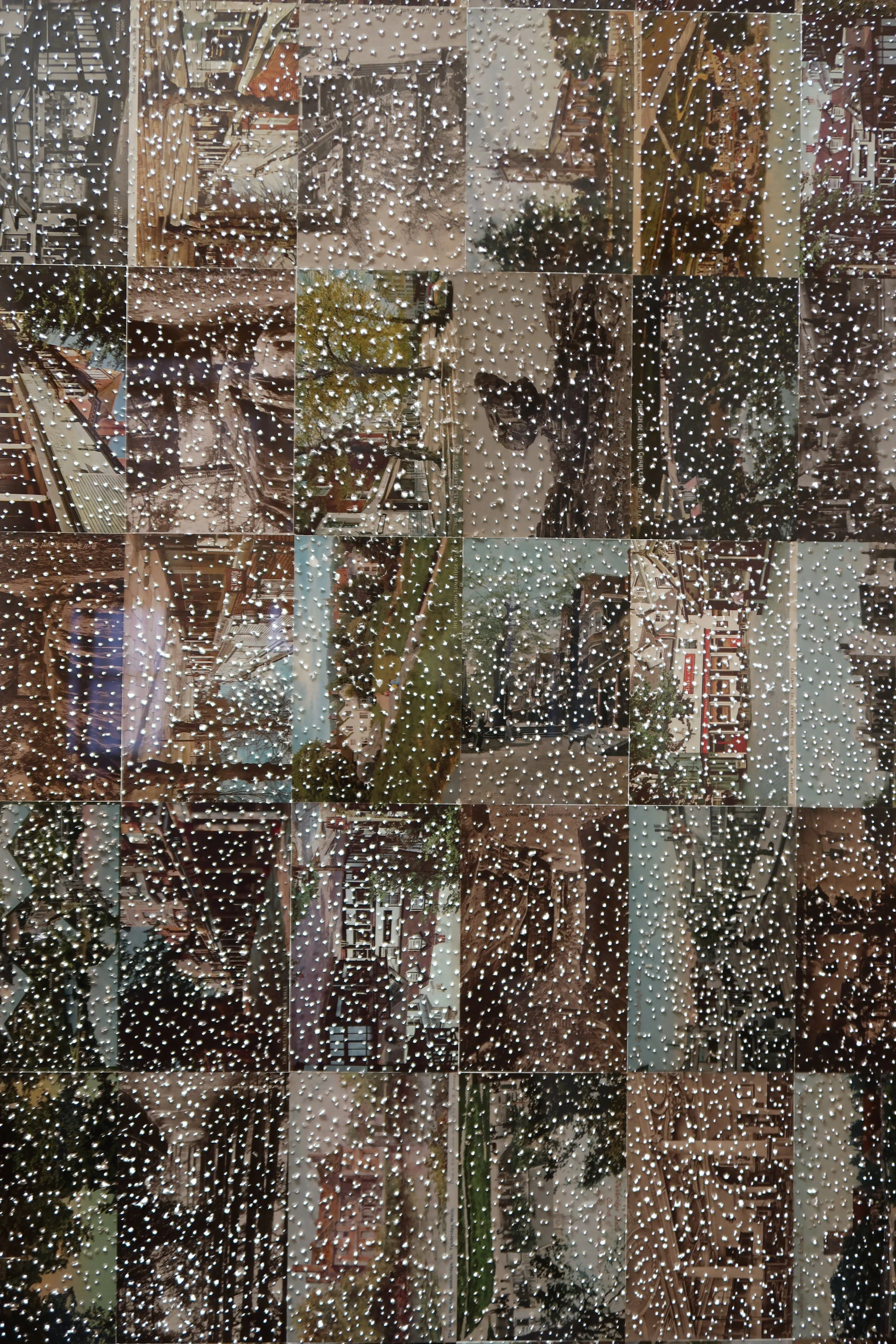
GREETINGS FROM TUNBRIDGE WELLS | 2018

7
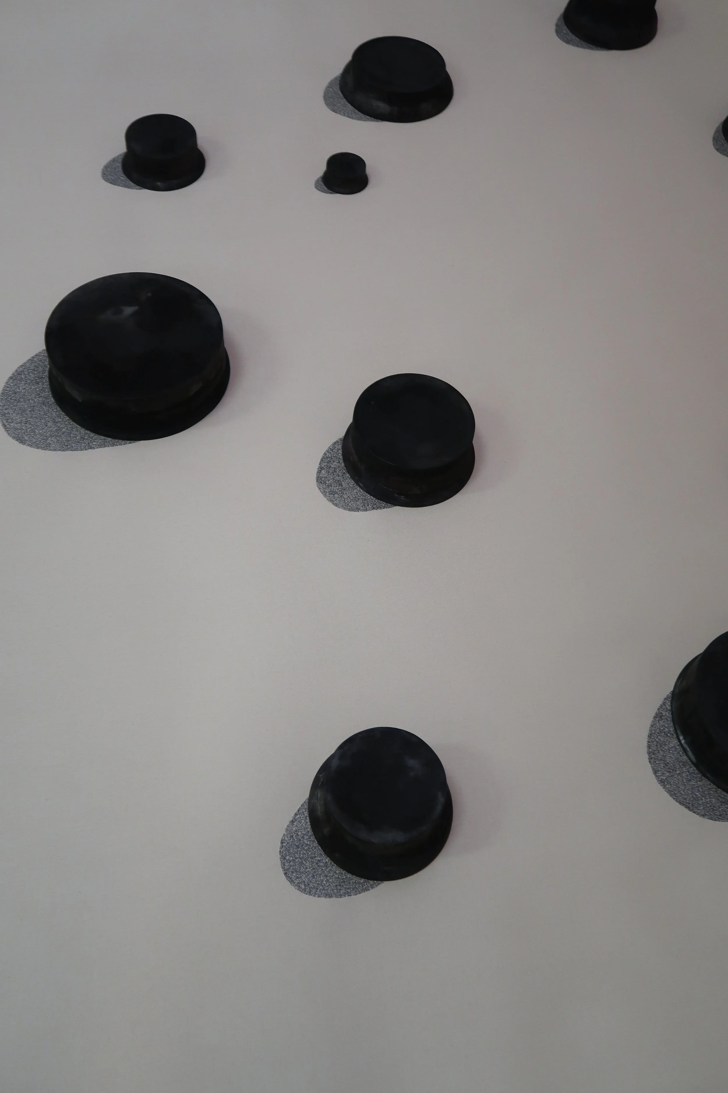
HOUSED | 2018

6
SHELVED | 2018
2
STILL LIFE | 2018

2
ZOO | 2018

2
VACANT | 2018

2
LIMBO | 2018
2
LANDED GENTRY | 2017
3
LOST SOULS | 2017

2
An Answer to a Satyr Against Mankind | 2017

1
FABLES BY THE LATE MR GAY | 2017 (TP)

5
AROUND | 2016

2
GROUP | 2016

3
FOUR QUARTETS | 2014

5
A LITTLE TREACHERY (i) | 2014

4
A LITTLE TREACHERY (ii) | 2014

2
SELECTED FABLES | 2013 (TP)

2
Imperatoris Iustiniani Institutionum Libri IIII | 2013 (TP)